Democratising data design: hierarchies of technical knowledge in data collection software

This post is part 3 of a series inspired by the presentation we gave to the ARDC Platforms Community of Practice about the generation and management of user requirements. Our first posts considered the perspective of the Product Owner and the Subject-Matter Expert. This post will consider the view of the end user.
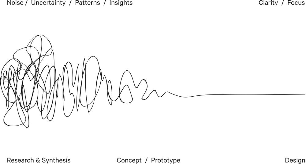
Over the 9 years of deploying FAIMS modules, hundreds of individuals have spent tens of thousands of hours collecting data on the app. Of the chief investigators, collaborators, students and volunteers who logged in and tapped away for all those hours, the majority of these users had no involvement in or even knowledge of the complex design work that occurred. This ‘squiggling’ occurred in the weeks or months before they showed up on site, in the middle of nowhere, to record their important thing. This is as it should be: the design process must be in service to the task at hand.
Furthermore, we specifically designed FAIMS to scale to accommodate the needs of a recording team with variable skill levels. We have in-built help menus, picture dictionaries, and user-level controls that can deploy a different interface with, say, the common rather than scientific names for species pending on the user level—all while recording the same data behind the scenes.
For these users, the experience of FAIMS—or any data recording software—is inextricably tied to the module design. Some users have mistakenly assumed that FAIMS was for ‘survey’ or ‘excavation’. (As we explained in the presentation—that was originally our plan, but the variable landscape of recording systems and language even in niche areas of research made it clear that that wasn’t possible.)
When we (as the software designers) ask for evaluations from this user group the feedback is mediated by the experience of the workflow. The success of that workflow is dependent on both our ability to read the minds of our 'clients' and their ability to assess and predict their users’ needs and most understandable user experience to fulfil those needs.
While it is acknowledged that one of the fundamental challenges of software design—or any design—is translating the needs of users/clients to those writing the code; a concomitant challenge is giving the user/client a sense of what the possibilities are.
All design is limited by the mode of creation or in the case of data-collection: the mode of capture. A workflow deployed on a mobile device will be different to one deployed on a desktop and will always be different to a paper recording workflow. Yet some habits or comforts of working on paper—like a certain amount of blank space prompting the recorder to enter information—will be recreated in digital workflows because they are expected to serve the same purpose.
This is the important role that we (unintentionally) have played in FAIMS 2.6. While we designed the platform with the expectation that researchers would draft their own modules from scratch, to date only two groups that we know of have done this.1 For the remainder, we have become agents of the design practice, subtly enhancing the workflows of many collaborating researchers.2
For those who have been following the FAIMS 3.0 development progress you will know that we are building a graphic-user interface (GUI) to allow for self-customisation. It’s not because we don’t like modelling data (I personally adore a good object flow chart!) but there is an unnecessary cost in translation that many user/clients rightly don’t have the time or funds to invest in this stage of their research.
One of the challenges of the DIY model, however, is that our agency as design advocates becomes harder to maintain. If the user’s experience of FAIMS is mediated by the workflow, that experience will be mostly out of our hands. We will no longer be able to suggest workarounds and practices that we know work on our system while in the field.
It is for this reason that our team at AAO has had dedicated user-experience developers on board in all stages of the project and they are front-loading the design of our GUI. The shape and nature of this interface will be the substitute for our previous role. As it was for FAIMS 2.6, of course, it is the end users who will determine whether or not we have succeeded in this role. Unlike FAIMS 2.6, however, those end users will have the freedom to jump on the GUI and have a go at something better. We’re looking forward to this new era of user-driven enhancement.
And even in VanValkenburgh, P., Silva, L., Repetti-Ludlow, C., Gardner, J., Crook, J., & Ballsun-Stanton, B. (2018). Mobilization as Mediation: Implementing a Tablet-Based Recording System for Ceramic Classification. Advances in Archaeological Practice, 6(4), 342-356. doi:10.1017/aap.2018.12, note the presence of a member of the team on the list of authors.
The collaboration goes both ways. As much as we hope we have enhanced the recording systems we have worked on if only in a small way, the lessons learned from comparing and contrasting different systems has taught us much that we can share with others.
For more news, subscribe!


