Dev Diary 7: Focus groups and participatory design
A shorter longer update this fortnight because Penny and Brian just finished running focus groups at UNSW! Also a short reflection on participatory design in 2022…

“I’m a bit of a numpty, but even I can do this [designing a notebook]” — Focus group participant
Focus group report — Brian’s reflection
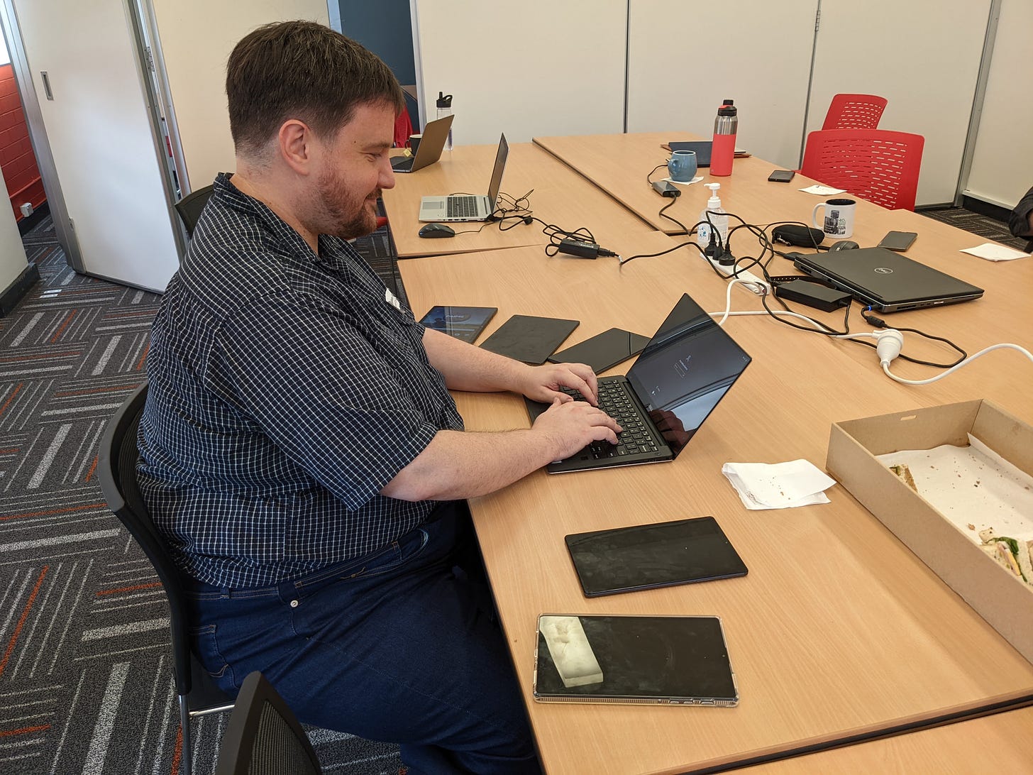
The major news this update is that we conducted our first focus group over at UNSW Sydney. We recruited project participants to test an existing notebook and then to try their hands at notebook creation. We brainstormed ideas and improvements and “features we would pay for”1 on a nearby whiteboard as participants worked through sample notebooks and reflected on their experience.
As with any first test of a software product, it was not without hiccups.

After a highly successful recording session out on the central UNSW walk in front of the chemistry building, none of the tablets deployed late last night were syncing. While Penny pivoted to discussion and feedback around the data collection process, I started digging into the problem. Only to discover about an hour later a sync bug due to my fake-users with free email addresses2. There’s nothing like the first deploy in front of a live audience to highlight the gulf of a developer’s “It works for me” and actual pragmatic reality.

We then had a lovely catered lunch of sandwiches3, and turned to the notebook creator. Watching how people engaged with this early-beta software was amazing. They dived right in and started making notebooks and asking about various deployment scenarios. And while Penny and I will miss the flexibility of an entire runtime scripting system allowing for a decade worth of hacks to be accumulated into a working system™, the GUI notebook creator was a hit with our participants. They all had ideas about how they could use FAIMS3 now to improve their various workflows.
Despite teething troubles, our first focus group went very well indeed. FAIMS3 is so much lighter weight (figuratively and literally) than earlier FAIMS deploys: I didn’t have to lug around a server and access point for a local deployment, and the app worked in browser and on tablet! It clearly solves a profound need for sophisticated offline data collection systems which are user-customisable. Now all we need is to finish our iOS deployment4.
Our next task is… to prepare to give this focus group… remotely…
Dev Update
Brian delivered a python script that can edit and delete5 records from an external command-line. We’re making progress towards a proper API! AAO continued working on authentication and notebook and record visibility6. Penny made two new notebooks using the notebook creator as part of our preparation for the focus groups without needing to deploy any code at all. I’m working on this blog post instead of working on our CSV exporter…
Whither Participatory Design?
This reflection stems from work on a forthcoming paper that Shawn Ross and I were furiously editing over the weekend. In that, we were reflecting on what implementations of FAIR data support were adopted by our FAIMS 2.6 users. I observed that there was a large gulf between the interface- and data-desires expressed by those archaeologists with their feet in the dirt and the folks calling for FAIR data7 in 2012-2022. I was also working on a public response to a paper I’m peer reviewing for IACAP, at the invitation of some journal editors, wherein I had cause to refer to Participatory Design.
Participatory design is a remarkably egalitarian technique:
“a process of investigating, understanding, reflecting upon, establishing, developing, and supporting mutual learning between multiple participants in collective ‘reflection-in-action’ (Schön, 1983). The participants typically undertake the two principal roles of users and designers where the designers strive to learn the realities of the users’ situation while the users strive to articulate their desired aims and learn appropriate technological means to obtain them” (Simonsen and Robertson 2012)
Two decades ago, one of the major themes of my Human-Computer Interaction classes was exploring themes of Participatory Design and User-Centered Design. These trends involved the direct participation in users and stakeholders in the design of software systems intended to support them. In many ways, these trends were opposing the Waterfall Software Development Life-Cycle trends in the 1960s through to the 1990s where every element of the interface (if it was ever specified) was designed via committee or fiat — an afterthought to functionality specifications.
These trends led to many many interviews, iterations, and Volvo’s cars. Advice given from CSIRO’s ON Prime incubator echoes the discussion of focusing products on user pain-points to drive adoption. There are calls for slower development, involving users in each stage, and being thoughtful about deployment. These intentions are why we’re running focus groups to get stakeholder feedback. Decades in, they’ve merged into this “Well, of course you get feedback!” impulse.
And yet there’s a tension between users. First, if you ask a room full of archaeologists what they want:
We have found they have trouble agreeing on much of anything in terms of fields and specifics of data collection approach. Which users should we have listened to?8
With FAIMS and workflow-specific notebooks we built workflows for almost 70 different teams. None of these teams asked for FAIR data features9. They were, quite correctly, concerned with the pragmatic realities of collecting data while hot/cold/wet/muddy/student in order to support their research. All of the effort we put into designing GIS functionality went almost entirely unused10.
As a point for discussion this week11 what is a useful balance between high quality outputs, theoretical imperatives, the designs requested by user, and budget? Given an infinite budget, we can certainly achieve a maximal outcome for all persons and all people. Participatory design would push the nomogram away from FAIR data purely into those features desired by users. We’d quite prefer to push (just a little) away from “everything in the same spreadsheet with colours providing meaningful metadata.” Norman observes:
HCD asserts as a basic tenet that technology adapts to the person. In ACD, we admit that much of human behavior can be thought of as an adaptation to the powers and limitations of technology … People do adapt to technology. It changes social and family structure. It changes our lives. Activity-centered design not only understands this, but might very well exploit it.
Where should the balance fall for FAIMS3? What features should we sacrifice for that balance?
Bonus question on the economics of Free, Perfect, Instant
My student Ewan Coopey just linked David Lewis’s recent publication Digital Publishing’s Four Challenges to me. While it avoids talking about data preservation as it is focused on the challenges of digital on publication, the bit on “free, perfect, instant” spoke to me:
That is, a copy can be instantaneously delivered anywhere in the world, a copy is the same as the original, and a copy can be made at zero marginal cost. They go on to explain, “Free, perfect, and instant make a powerful combination, worth more than each of these characteristics separately. Thus, it is very difficult to compete with. . . . For most of history, few, if any, goods and services have been free, perfect, and instant. But with digital, networked goods, these three properties are automatic.”
From the economic perspective, the efficient price for a good, that is, the price that will generate the most societal benefit, is its marginal cost. For a digital good, that cost is zero.
When researchers are willing to pay (relatively) little in terms of time and money for a skeuomorphic representation of their traditional recording sheets in order to get a free, perfect, instant digital copy — but are willing to pay less for a more inconvenient form which other folk might try to persuade them is better in the long term (FAIR data, normalised data…) — how do we square this circle? At present, researchers working with us get what they want because they pay for it. While we try to nudge here and there with advice while we’ve been making bespoke 2.6 modules, even that will fall away with the democratic notebook creator of FAIMS3. How do we balance these priorities such that the platform continues to function, we support FAIR data, and — most importantly — we support researchers in the field?
What I’m reading this week
A journal article on Digital Publishing’s Four Challenges
A lot of stuff on the Australian Election12. Here’s a great video on preferential voting.
Greg Wilson on Role Clarity deficiencies wrecking teams
LPP Fusion’s quarterly report on the engineering hurdles they’re working past on their way to fusion.
Morgan Housel on Failures to forecast the future because of surprises.
And a whole bunch of fanfic and web serials that I won’t share without invitation. Some $unit_of_time, one needs candy floss for the brain.
A filtering strategy from CSIRO On Prime
Specifically, we found that users with `gmail.com` weren’t assigned a second group. This then caused a problem with the list of groups to instead be returned as a string.
Thank you so much, UNSW team!
And a whole bunch of other things I regrettably do not have time to list in this footnote.
Hide. Never true delete.
I’d show you a screenshot, but an empty list of notebooks is not very compelling…
We are hoping to narrow that gap in FAIMS3, FYI.
It is this feedback that made me design a generalised data-collection app, so that the answer is “Each of them, individually”.
That I remember.
A big chunk of that was our fault, in terms of the complexity of the GIS system — but few teams even asked about potential costs.
, class,
As a new citizen to Australia, it’s my first time voting here — and I’m clearly taking the process far more seriously than most of the candidates, judging from their lack of SEO.
For more news, subscribe!


